A New Admin Look Arrives
Since its launch in 2008, Omeka Classic has only had one major interface overhaul which came with the version 2.0 release in 2013. 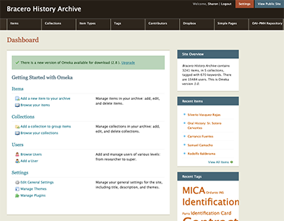 At that time we continued the basic color scheme of earth tones, but now we’ve moved in the direction that echoes the branding for Omeka Classic and Omeka.net.
Under the direction of Omeka’s lead designer, Kim Nguyen, we have been hard at work for many months to bring you today’s release of Omeka Classic 3.0. This version of the platform sports a completely redesigned administrative interface. The software retains all the functionality that you and hundreds of thousands of other users have come to know and love over the years, while also maintaining and extending our commitment to responsiveness and accessibility.
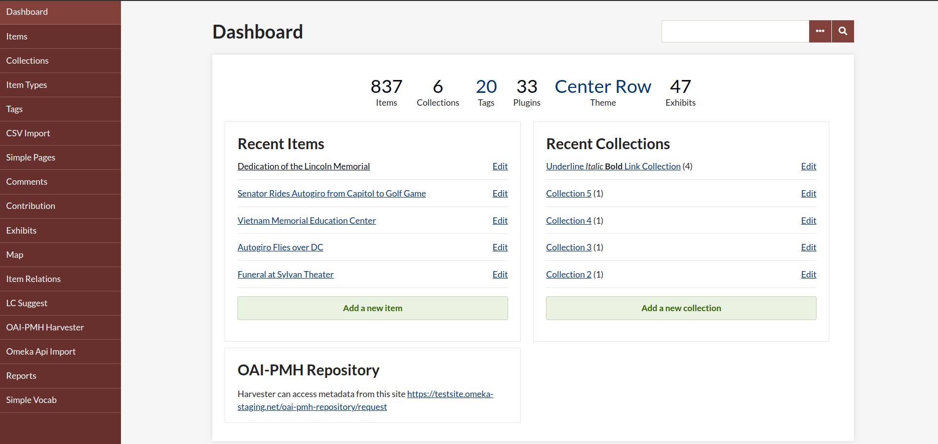
For this release, every administrative view of the core has been updated with a fresh new theme. We had a crucial assist in this base work from our friend Michael Tedeschi, who did the first pass at the design. Then, Kim undertook the massive task of tweaking and applying those styles to the full range of views and elements across the platform. Each plugin had to be reviewed, restyled, tested, and retested across browsers and devices. When we were satisfied with the implementation, we turned our attention to updating the documentation, which included a review of dozens of pages and the replacement of all the screenshots. (Big shout out to Katherine Knowles for the heavy lifting here!)
Ken Albers and John Flatness managed the deployment of the new versions of the core, plugins, and the documentation, providing seamless service to you, the more 80,000 users who work with Omeka.net.
We hope you enjoy the new look, and as always, we’re eager to hear from you about your work!
Back to News