Manage Themes
Note: Themes downloaded from Omeka.org will not work on Omeka.net
Themes control the public design and presentation of a website, including the main navigation. Manage your themes by clicking on the Appearance tab in the top navigation of the admin dashboard. The first tab to load within Appearance will be the Themes tab (admin/themes/browse).
Watch this screencast to see how to modify the appearance of your site.
Choosing a theme
If you want to change the design theme from the default choice, click the green Use This Theme button below the theme’s thumbnail image in the theme browse page.
Configuring a theme
Configurations let you make choices about the look of your site, including adding a logo and homepage text, managing featured elements, and adding footer text. Each configuration is unique to each theme and will be saved with that theme.
Click the blue Configure Theme button under the image of your current theme to customize your site.
The following choices are available for Omeka.net themes (not all options are available for all themes):
Header and Footer Configuration:
- Logo File: You may upload a logo file that will replace the site title in the header of the theme. Recommended maximum width for the logo is 500px.
- Header Backgound: Upload an image file that will display across the top of your public website.
- Footer Text: Add some text to be displayed in your theme’s footer. This can be a good place to add credits.
- Display Copyright in Footer: Check this box if you wish to display your site’s copyright information in the footer. Site copyright information is found in the General Settings section.
- Use advanced site-wide search: check this box to allow users to search your whole site by record using advanced search options.
Homepage Configuration:
- Display Featured Item: Check this box if you wish to show a featured item on the homepage.
- Display Featured Collection: Check this box if you wish to show a link featuring a collection on the homepage.
- Display Featured Exhibit: Check this box if you wish to show a link featuring an exhibit on the homepage.
- Homepage Recent Items: Enter the number of recent items you want to be displayed on the homepage. The items will appear in the order in which they were mostly recently added to the archive.
- Homepage Text: Add text to be displayed on your homepage above the Featured Items. This is a good place to add a very short tagline or description of your site. Save longer explanations for an About page.
Additional Configuration Options:
- Item File Gallery: For the themes Thanks Roy, Seasons, Minimalist, and Emiglio. This box displays the files for each item as a gallery of square thumbnails rather than fullsize images.
- Style Sheet: For the themes Seasons and Rhythm. Select a style sheet (color scheme) from a dropdown menu.
- Exhibit Builder navigation: For the themes Seasons and Minimalist. Choose whether page navigation in exhibits is a full-width bar that stretches across the page or a sidebar that uses a small fraction of the page width.
- Colors: For the themes Thanks Roy, Center Row, The Daily, Big Stuff, . These fields allow you to customize the color of specific parts of the theme (link text, buttons, etc). You must use a six-character hexadecimal color value, including the
#. - Homepage Text position: A dropdown menu to set whether the homepage text appears above or below featured items, exhibits, and collections.
- Big Stuff: has a number of unique configuration options
Save Changes at any time to save these customizations.
Themes
Berlin
A clean, two-column theme with a horizontal navigation menu.
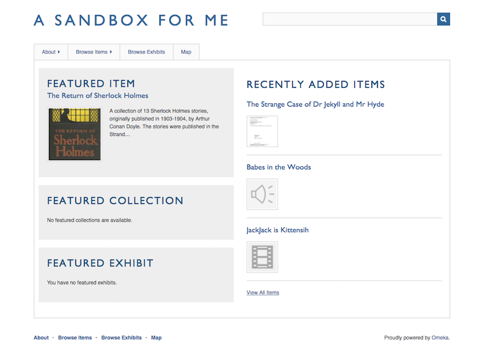
This theme is available for all plans.
Seasons
A colorful theme with a configuration option to switch style sheets for a particular season, plus ‘night’. Horizontal navigation menu.
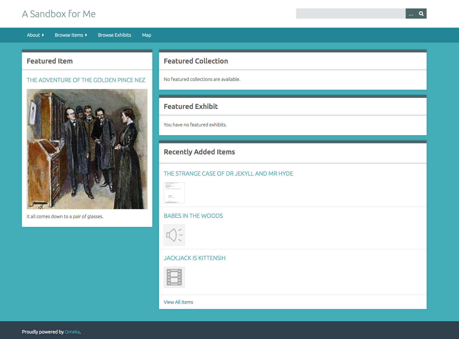
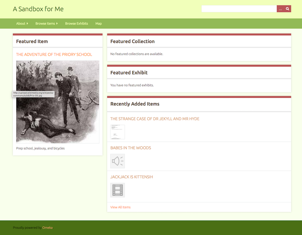
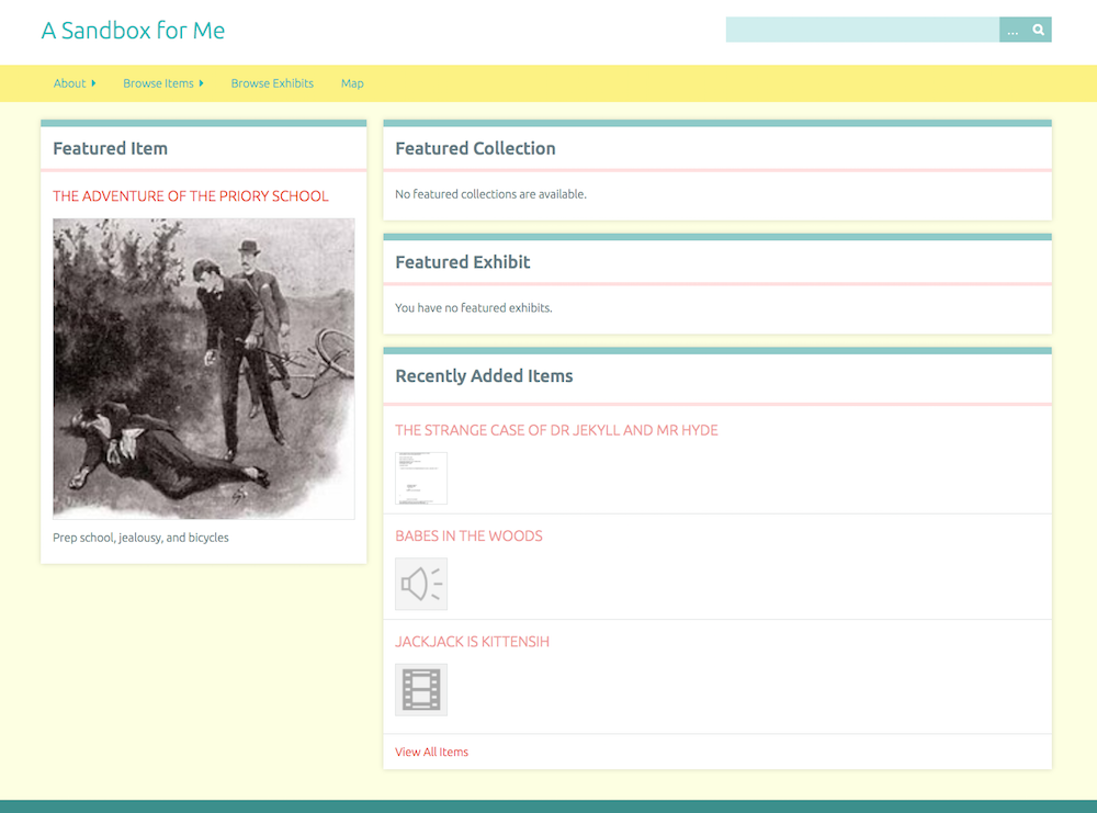
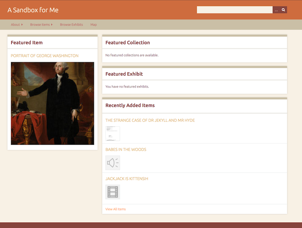
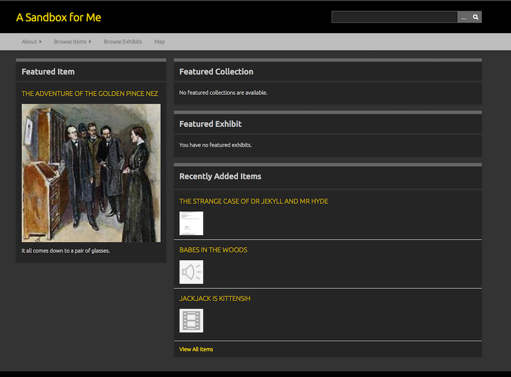
This theme is available for all plans.
Big Stuff
Inspired by Berlin, this theme is designed for textual collections; the Browse Items page displays item titles only. It includes a number of customization options, including a repeating background image.
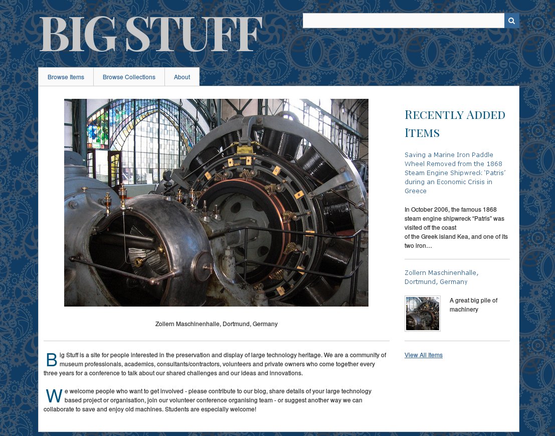
This theme is available for Plus, Silver, Gold, and Platinum plans
Emiglio
A simple, minimal theme with reds and greens and a horizontal navigation menu.
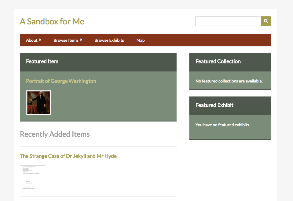
This theme is available for Plus, Silver, Gold, and Platinum plans
Foundation
A starter theme using the ZURB Foundation toolkit.
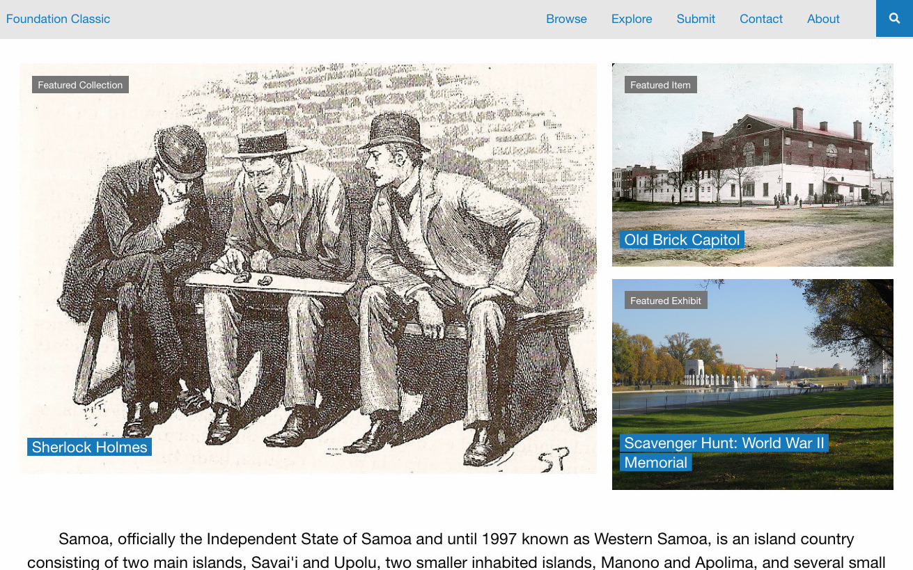
This theme is available for Plus, Silver, Gold, and Platinum plans
Freedom
An Omeka Classic Theme based on modular styling and mobile first approach, with a modern and accessible UX/UI.
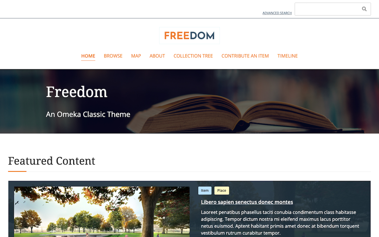
This theme is available for Plus, Silver, Gold, and Platinum plans
Minimalist
A theme with clean, architectural lines and a horizontal navigation menu.
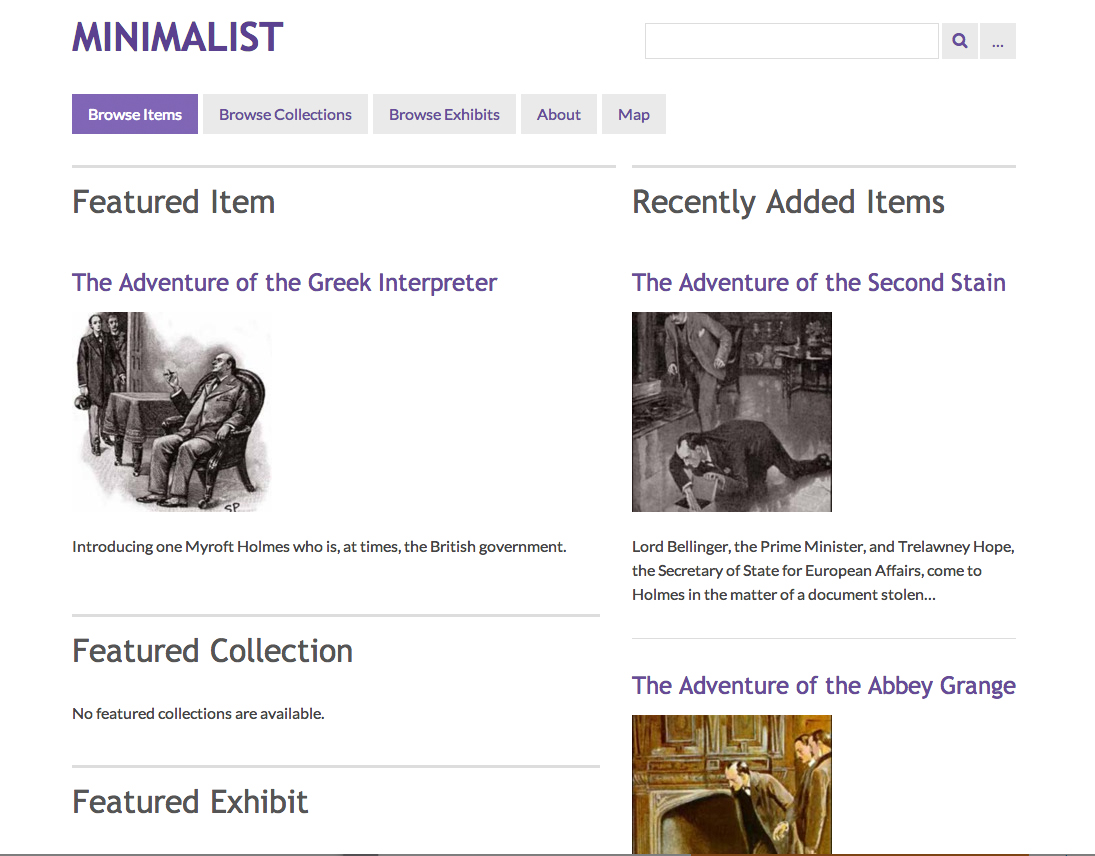
This theme is available for Plus, Silver, Gold, and Platinum plans
Rhythm
An energetic two-column theme, with a choice between three style sheet color themes. Horizontal navigation menu.
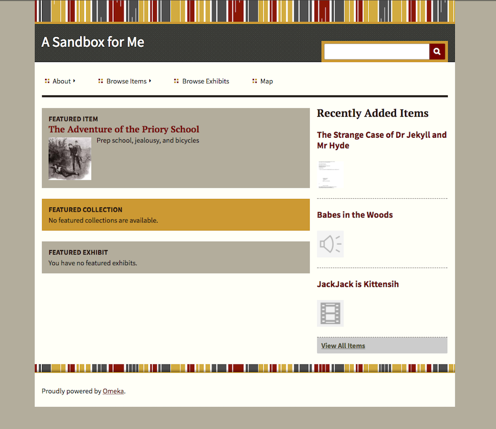
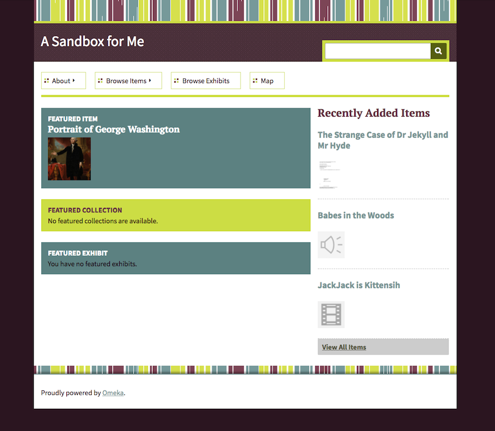
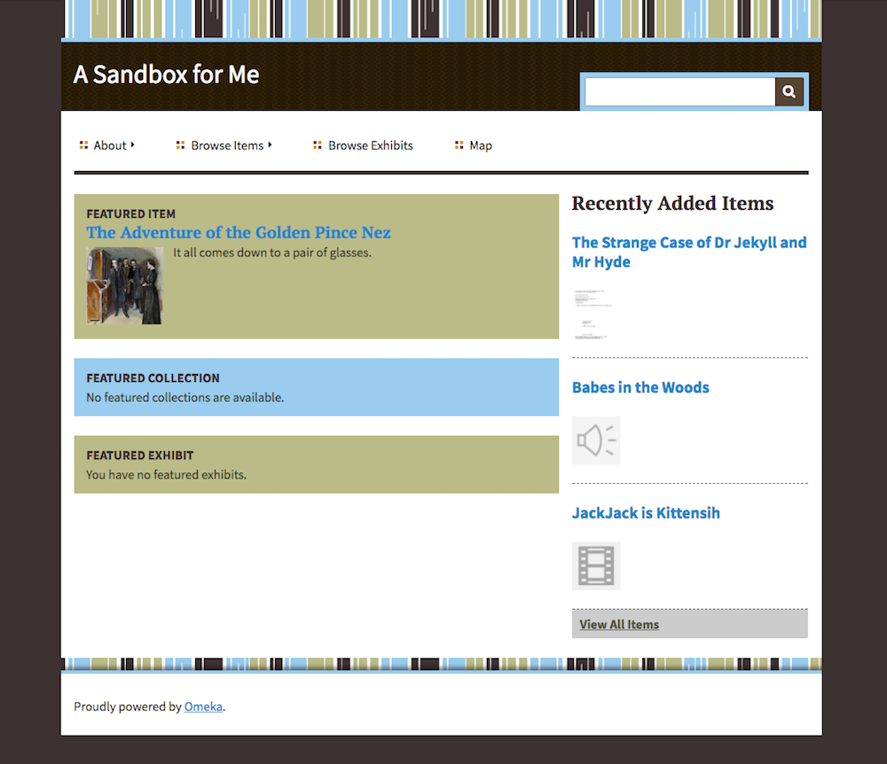
This theme is available for Plus, Silver, Gold, and Platinum plans.
Santa Fe
Inspired by the Bracero History Archive, this theme in browns and greens uses a horizontal navigation menu above the site title.
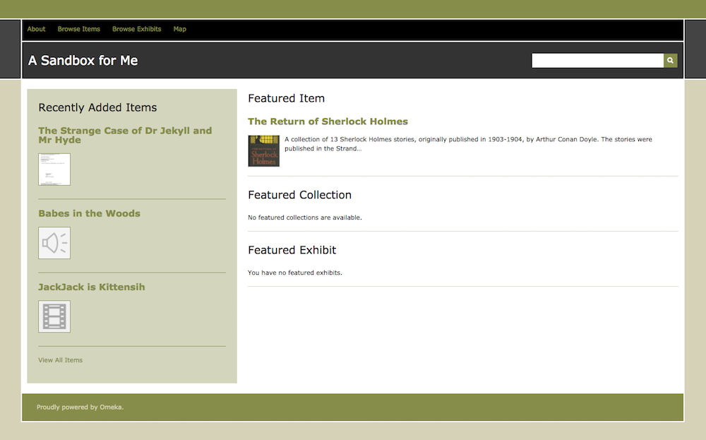
This theme is available for Plus, Silver, Gold, and Platinum plans
Thanks, Roy
A tribute to Roy Rosenzweig, this theme features serif text, a vertical navigation on the left side of the content, and options for customizing some font and background colors. Files display before
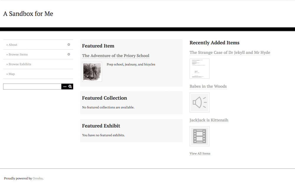
This theme is available for Plus, Silver, Gold, and Platinum plans
Big Picture
An image-centric theme geared towards art historians and students. The navigation opens as a menu from the upper right corner of the browser window.
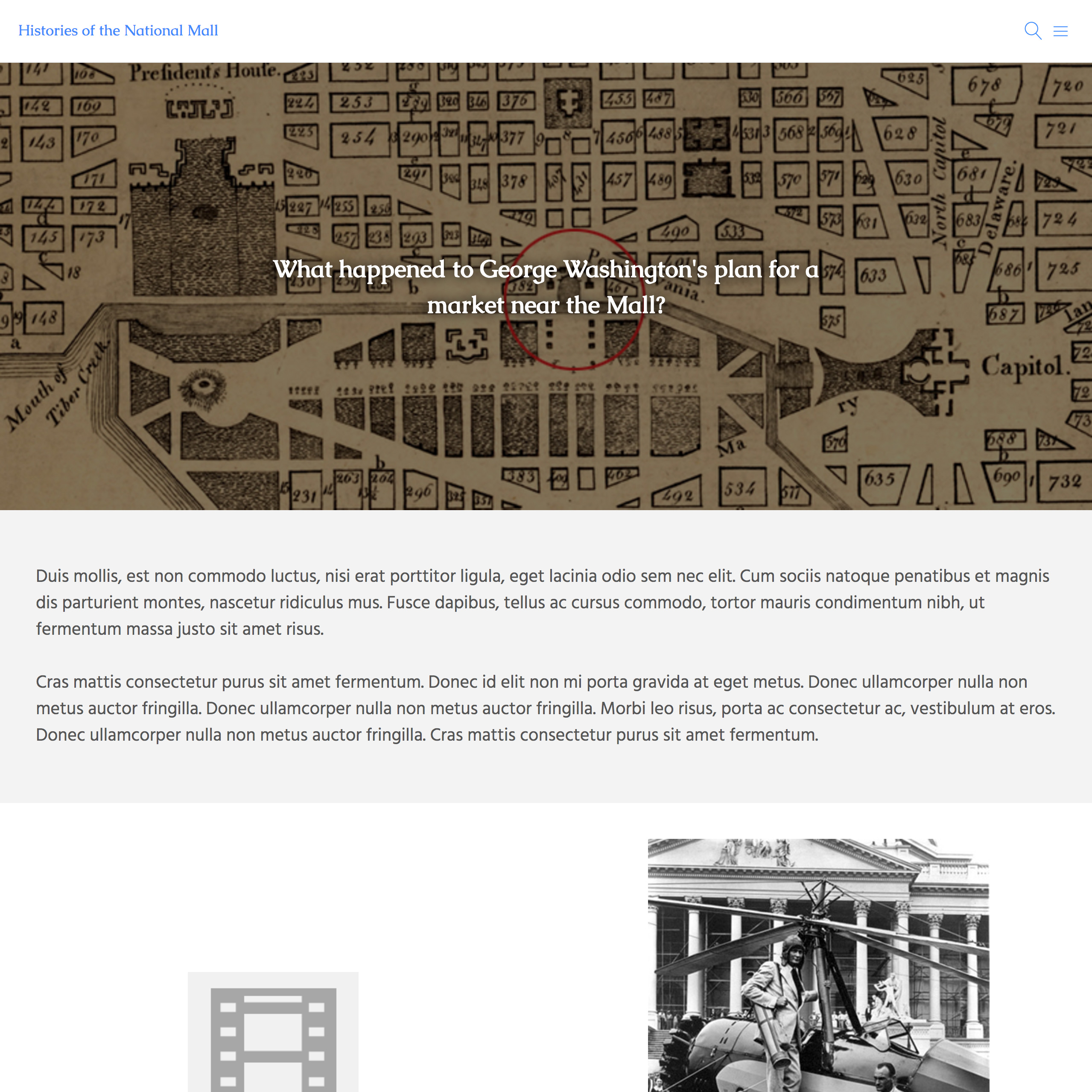
This theme is available for Gold and Platinum plans.
Center Row
An image-oriented theme for Omeka. This theme has a horizontal navigation menu and does not support nested navigation (no sub pages).
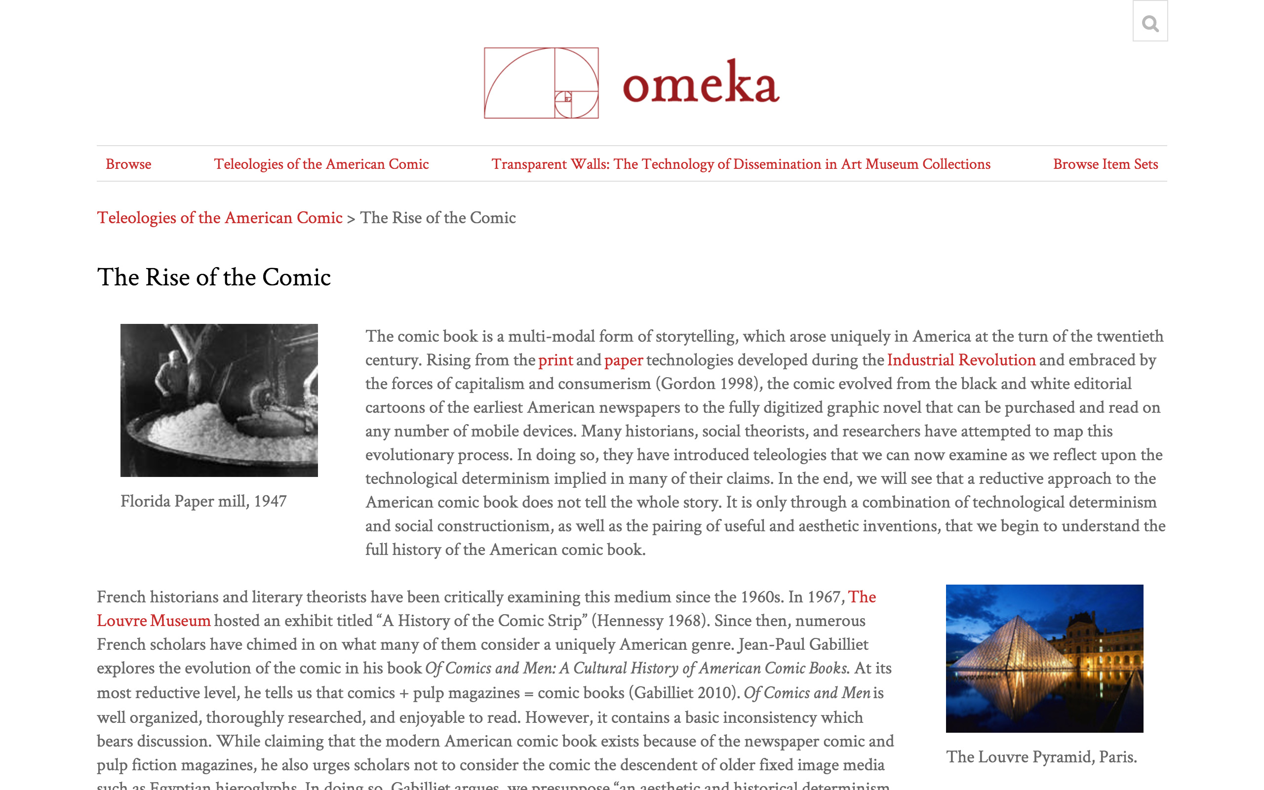
This theme is available for Gold and Platinum plans.
The Daily
An image-oriented theme for Omeka with strong fonts and custom color configuration options for some text and background settings. The navigation opens as a menu from the upper right corner of the browser window.
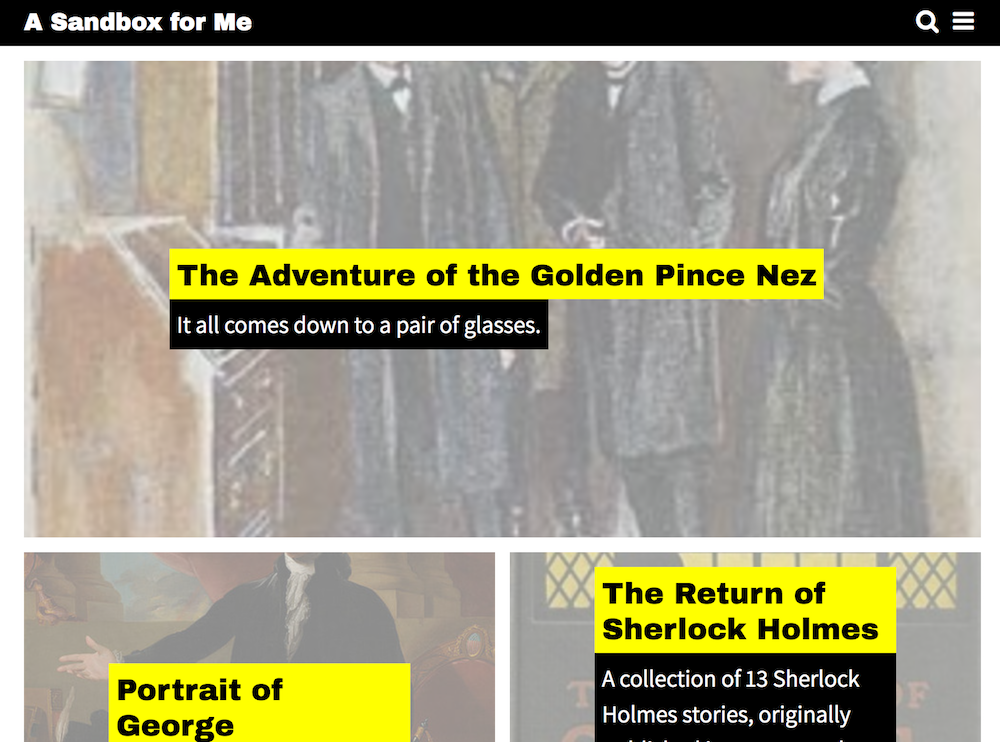
This theme is available for Gold and Platinum plans.
Back to top